Showing posts with label Farrow and Ball. Show all posts

Wednesday, April 19, 2023

Feeling Blue

Mark D. Sikes

 
This wonderful breakfast room is in Liz Lange's beautiful restoration of the iconic East Hampton home Grey Gardens.

Tuesday, May 17, 2022

The Blue and White Breakfast Nook

Hallie Neley Sims - House Beautiful


This darling breakfast nook right off the kitchen features the iconic wallpaper Quadrille Climbing Hydrangea. This is a great wallpaper for anywhere, working beautifully in literally any room of the house.

Sunday, August 1, 2021

The Chinoiserie Bathroom

Jennifer Wright - House & Home

 Red, white and blue rooms are so often not done well, but this one is perfection, from the marble clad tub to the Moroccan trellis wallpaper, the blue and white Chinese cachepot with an orchid and that red pagoda mirror. Seriously Chinoiserie Chic! I love the navy and white striped soap dispenser too - a wonderful little nautical touch.

Let's find a pagoda mirror. 

Friday, May 4, 2018

The Chinoiserie Nursery

Pinterest

Framed Chinoiserie panels are a sophisticated choice in this nursery - the walls are painted in a favorite color of mine - Farrow & Ball Borrowed Light.

Friday, July 14, 2017

Red, White, and Blue

Farrow and Ball - St. Giles Blue

A wonderful blue paint color is the perfect backdrop for this Chinese Chippendale chair and double gourd Chinese lamp.

Wednesday, September 21, 2016

Secrets to Steal

Sam Allen - House Beautiful
Some great tips to steal here for a tiny Chinoiserie entryway -

Fresh flowers
Large ginger jars on a small table
An orange lamp shade really pops with the blue and white
A favorite neutral paint - Farrow & Ball Light Gray

Friday, July 22, 2016

Wednesday, March 26, 2014

My Tips on Choosing Paint Colors

Farrow & Ball's colors

This week we are doing a preview of the next One Room Challenge that begins on April 2nd with questions I have been asked about the ORC and about the process of designing a room. I am very often asked how to go about choosing a paint color from the zillions of paint colors out there. The answer is actually simple.

NARROW YOUR CHOICES -

1. Choose a paint company - I personally love Farrow & Ball and Benjamin Moore. There are other high end paints out there, but these are my go-to paints. I'm sorry, but with cheap paint, the colors are horrible and the finish is even worse. Your walls will look like they are coated in plastic.

2. Choose a collection from the company you have selected - I love all of Farrow & Ball's colors and it has only one color card with a highly edited 132 colors. And they are all gorgeous! I am also a huge fan of Benjamin Moore's Historical Collection that has only 174 colors.

You will be overwhelmed looking at thousands of paint swatches. People go nuts with all the choices and they panic and they choose white. Benjamin Moore alone has 3,400 colors. Narrow it down to a collection you love and stick with it. They have already done the work for you.

Love Darryl Carter? He has a collection for Benjamin Moore.
Love Candice Olson? She has a collection for Benjamin Moore.
Love Ralph Lauren? He has his own paint line with gorgeous colors.

Find a palette that has your "world view" and use colors from that collection throughout your house. Your house will have a much better flow.

3. The reason that I choose high quality paint is that the colors are more pigmented, complex and sophisticated. You get far richer color on your walls that changes colors in different light and and the finish is far more elegant and rich. I love a flat finish and use it everywhere including kitchens and bathrooms. In Benjamin Moore, I always use their Aura line.

4. I hate white and beige, but I love soft and gentle paint colors. They are the perfect backdrop for all the color that I love in a room and they don't fight with it. Choose colors that are somewhat muddied or grayed for a more sophisticated palette. Colors that are too clear tend to look tacky once they go up. I was at a book signing for Farrow & Ball at my favorite local paint store Color Wheel in McLean a while back. I remember the speaker saying that Farrow & Ball does not do "pretty colors." If you look at their colors, you will understand what he meant. Colors that are pretty in a swatch tend to look cheesy on your walls.

Here are some of my top favorites I have used in my own home and clients' homes. I used Benjamin Moore Icy Morn in my One Room Challenge kitchen and I used Benjamin Moore Stonington Gray in my One Room Challenge powder room. I have decided on a Benjamin Moore paint color for my next One Room Challenge room as well.

Benjamin Moore Icy Morn

Benjamin Moore Glass Slipper

Benjamin Moore Stonington Gray

Farrow & Ball Middleton Pink

Farrow & Ball Borrowed Light

Benjamin Moore Early Frost


Wednesday, September 18, 2013

2014 Color of the Year?


I have posted several times lately about how I am seeing more and more shades of purple used in interior design and how beautifully purple combines with Chinoiserie. I especially like lilacs and lavenders and soft purples with gray or blue undertones. I have a Pinterest board on the subject here. I remember being at a Farrow & Ball party a few years ago and asking one of the F&B executives why there was not lavender or lilac in their color range. The response was, "We don't do pretty colors." Farrow and Ball has now added a lavender gray I love called Calluna that they describe as "a much requested pretty heather colour." I guess they changed their minds.

Above is another wonderful example of combining purple and Chinoiserie - Nicolette Horn's master bedroom in Oslo in violet. I suspect that we are about to see colors in the purple family named as hot colors for 2014 and perhaps even as color of the year by someone. We shall see. For lots more inspiration on combining purple and Chinoiserie, don't miss my September Houzz Ideabook here.

Farrow & Ball Calluna

Saturday, June 1, 2013

Saturday Inspiration


On Thursday I posted on the lounge and powder room that Shelley Johnstone Paschke created for the 2013 Lake Forest Showhouse.  This is the entryway she designed for the 2011 Lake Forest Showhouse. The wallpaper is a favorite of mine, Farrow and Ball's Lotus. The bottom two pictures show this wallpaper used in two other rooms I have posted on. Note how in all three rooms this wallpaper is combined with Chinese porcelain.


Ryan Korban

Charleston Dining Room

Thursday, May 30, 2013

A Gorgeous Chinoiserie Powder Room


Having grown up in Lake Forest, Illinois, its great homes are still to me the most beautiful anywhere. The stage for the 15th biennial Lake Forest Showhouse was an Italian Renaissance 15,000 square foot estate designed in 1916 by famed architect David Adler.

Interior designer Shelley Johnstone Paschke designed the lounge and powder room. The lounge walls are lacquered in Farrow and Ball Saxon Green and are trimmed in gold. The ceiling is painted in faux malachite. Note the ivory silk curtains trimmed in Samuel and Sons Greek key, the Oscar de la Renta Zeus chair with tiger silk velvet, the sisal carpet, rustic baskets, lucite console, and antique Chinese export jars.

In the powder room area, she has papered the walls in Farrow & Ball Acanthus. I love the lucite stand with the blue and white Chinese jar and the starburst chandelier. All in all, a wonderful mix of many of my favorite elements.

Photos courtesy of Veranda.


Wednesday, April 17, 2013

Charleston Dining Room - Southern Chinoiserie


This Charleston dining room is a lovely example of "Southern Chinoiserie,"  a look that prevails in Alexandria, Virginia where I live. In this style dining room, crystal chandeliers, real Persian rugs, blue and white Chinese porcelain, and mahogany furniture are "required." The deep coral and turquoise blue of the Persian rug, the use of the dramatic Farrow & Ball wallpaper Lotus, the simple white curtains, and the oversized ginger jar make it "New Traditional" and keep it fresh.

Do you recall where we've seen Lotus wallpaper used before? In the NYC kitchen of Ryan Korban shown below, also with a large ginger jar. You can see how this pattern adds drama to any room. Another more modern approach used here is a single large ginger jar as opposed to a smaller pair. The Pink Pagoda has a lovely selection including large sizes that would make a real focal point.


Saturday, June 9, 2012

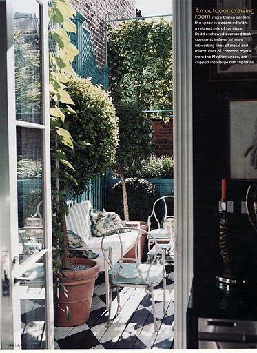
Redd and Blue Outdoors


I am "redecorating" my outdoor living area with lots of blue including blue and white Chinese porcelain. Miles Redd's fabulous outdoor patio in NYC has wonderful blue inspiration. The paint color is Calypso Blue by Benjamin Moore, very similar to the Farrow and Ball Chinese Blue I have used in my space. I really like the white Chinese garden stool, the mirrored coffee table, the garden urn as Champagne bucket, and the black and white floor.


Monday, February 21, 2011

Orange Chinoiserie


My favorite paint company, Farrow & Ball, has come out with its new colors for 2011. My favorite is this incredibly dramatic Charlotte's Locks. This could be used to great effect in the Chinoiserie room. Here is some inspiration.


Below, paint a Chinese Chippendale chair orange or a bamboo chair orange as in this room by Heather Collins.


Paint the legs of a faux bamboo stool orange as here.


Paint your walls orange-this room is by Sara Story with wallpaper, but the same result could be achieved with stenciling or faux painting.


Paint one wall orange as below from Domicile Interior Design.


Or perhaps a ceiling as here by Lynn Amon.


Tuesday, January 18, 2011

Update to Upside Down Wallpaper


In a humorous update to yesterday's post on the Farrow & Ball wallpaper hung upside down, it turns out the kitchen is in the apartment of Lonny editorial assistant Ellie Somerville. A renter, she hung the expensive wallpaper with double sided tape. So all is not lost, she can always rehang the wallpaper right side up in this apartment or the next if she wishes. All's well that ends well.

Monday, January 17, 2011

A Lonny Chinoiserie Mystery


A follower of Chinoiserie Chic and eagle eye emailed me that the Farrow & Ball wallpaper Wisteria in this Lonny kitchen above I posted on last week is upside down. She is of course correct-below is wisteria as it grows and below that the same wallpaper hung correctly. I wonder if this was done on purpose or accidentally? I much prefer it hung the right way-it looks more graceful. Quite interesting.


Wednesday, June 2, 2010

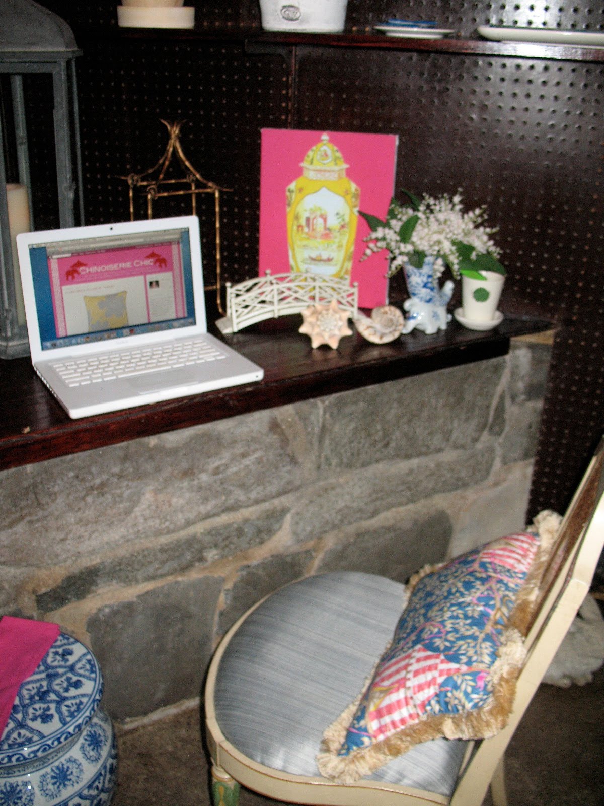
The Chinoiserie Blogger's Retreat


Longtime followers of Chinoiserie Chic may recall that last year, inspired in part by Miles Redd's iconic blue door, I painted my shed door in Farrow & Ball Chinese Blue and found a fabulous antique Tibetan dragon door knocker on eBay. I also spruced up the inside of the shed, painting the ceiling, staining the walls and shelves, hanging a chandelier, and organizing my gardening tools and flower arranging supplies. Here was the reveal. I was recently inspired by a gorgeous shed by interior designer Michael Devine to turn my shed into a spot where I can blog as well. Michael Devine was one of five designers involved in a great project at The Berkshire Botanical Garden called Living Stylishly in Nature: Re-Imagining the Humble Garden Shed. He imagined his shed as a spot where a garden blogger would sit and blog. By relocating a few items from my home, I have a great little spot to escape and blog. Stay tuned here over the next week for a series of posts on Chinoiserie ideas for furnishing your garden including more sheds, outdoor fabrics, furniture, and accessories.

My shed door


Mile's Redd's door


Michael Devine's shed


My shed-click on the photos to enlarge