 |
| Mary McDonald |
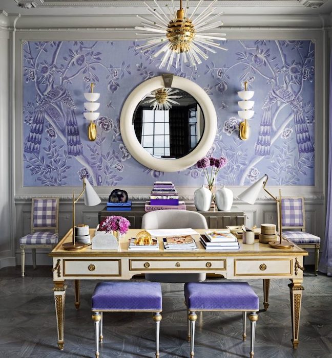
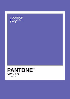
Pantone's Color of the Year 2022 is Very Peri, a deep periwinkle.
The color comes from the periwinkle plant, vinca minor. Periwinkle is known as the flower of death. It is native to Europe, where it was commonly known in folklore as the “flower of death” because its vines were woven into headbands worn by dead children or criminals on their way to execution.
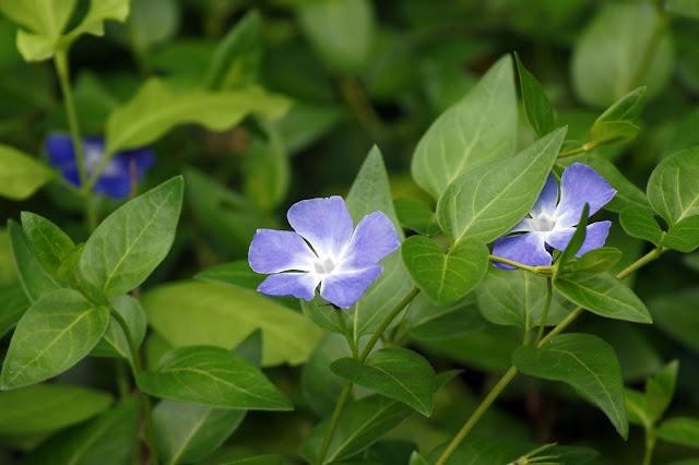 |
| Periwinkle |
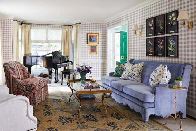
The color periwinkle ranges from a soft lavender blue to a deep saturated purply blue. I tend to prefer it in a softer tone. Here is a beautiful example by Summer Thornton with a periwinkle velvet sofa. I also love Mary McDonald's softer version above.
 |
| Summer Thornton |
Here is Pantone's explanation of their choice of this color. I personally have no idea what they are talking about. I am guessing it has something to do with Covid, but it's beyond me. It seems that Pantone is expressing existential angst in their choice of this color. They lost me at "global zeitgeist." It would appear that this color is what Pantone sees when they stare into the great abyss.
"We are living in transformative times. PANTONE 17-3938 Very Peri is a symbol of the global zeitgeist of the moment and the transition we are going through. As we emerge from an intense period of isolation, our notions and standards are changing, and our physical and digital lives have merged in new ways. Digital design helps us to stretch the limits of reality, opening the door to a dynamic virtual world where we can explore and create new color possibilities. With trends in gaming, the expanding popularity of the metaverse and rising artistic community in the digital space PANTONE 17-3938 Very Peri illustrates the fusion of modern life and how color trends in the digital world are being manifested in the physical world and vice versa."
“The Pantone Color of the Year reflects what is taking place in our global culture, expressing what people are looking for that color can hope to answer.” added Laurie Pressman, Vice President of the Pantone Color Institute. “Creating a new color for the first time in the history of our Pantone Color of the Year educational color program reflects the global innovation and transformation taking place. As society continues to recognize color as a critical form of communication, and a way to express and affect ideas and emotions and engage and connect, the complexity of this new red violet infused blue hue highlights the expansive possibilities that lay before us”.
I will be curious to see if this color catches on. My guess is no, as "light and bright" seems to be what people are still gravitating towards.



Seriously, Beth, that Pantone marketing mumbo jumbo says nothing to any of us. The color is a hard sell. Lovely in clothing and some soft furnishings etc, but for an entire room, especially painted walls, not an easy shade to live with. Happy New Year, with or without Veri Peri.
ReplyDeleteHappy New Year. I think the color is going to be a hard pass for most people.
DeleteFine for an accent, but otherwise.....notsomuch -!
ReplyDeleteI just bought a lace strapless bra in deep periwinkle - does that count?
DeleteHi Beth,
ReplyDeleteJust received my christmas present to myself. The BBB bar cart is gorgeous. I got it in black and just love it.Thanks for the great sources. I think the color of the year is really pretty but would have to be very light.
So glad you like the bar cart.
DeleteVerbal gobbledy-gook. I rather like the color, but I also prefer a much lighter tint of the color.
ReplyDeleteI love soft lavenders and such, I agree.
DeleteI actually like this color, and I'm not much of a purple person, but I think I could only take it in small doses.
ReplyDeleteI had no idea that Periwinkle was known as the flower of death! Yikes! My parents' back hillside is covered in this flowering vine, and as a little girl I had great fun picking it and making floral crowns for myself! I will never think of periwinkle in the same way again, Beth!
Lots of trivia from my landscape designs courses.
DeleteYou're right about Pantone's blurb. Sounds too serious, analytical and rather bleak to me. Certainly not inspirational in choosing a color, but I think our individual responses to certain colors are very emotional.
ReplyDeletePantone is suffering from depression I think.
DeleteBeth, you are spot on! People are looking for light & bright, not deep & brooding. Although a pretty color, it isn't going to be the 'go to' Pantone would like it to be this year.
ReplyDeleteDoes anybody even use Pantone paint?
DeleteThat description is nutty. What on earth!? Purple is definitely not a go-to color for me. Although I used Farrow and Ball Rangwali in my little girl's room once and it was stunning. Thats as close as I've come!
ReplyDeleteI love Farrow and Ball - they call Rangwali an adventurous pink.
DeleteI am so drawn to the golds and teals of the carpet, and that periwinkle just cuts the wrong way for me. Maybe an accent piece in a bedroom?
ReplyDeleteThat's funny - I really dislike everything in the room except for the periwinkle sofa.
Delete