 |
| Mark Sikes - Coastal Living |
A strange day yesterday. My painter contacted me that he has been hospitalized with Covid despite being vaccinated and boosted. He is of course in my thoughts and prayers for his full recovery. So my exterior painting is a bit up in the air.
And some positive news - the kitchen island was supposed to be delivered mid February, then delayed until late April/early May, now back to a mid February date. Yeah!
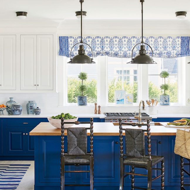
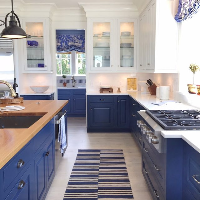
I was looking at some great kitchens like the one above getting styling ideas and something struck me as odd in one photo below. As those of you have commercial or professional style ranges know, they are generally deeper than regular ranges. Check out what Mark Sikes did in this kitchen to accommodate this. You see how he had the cabinets and counter jet out with side pieces to make it look built in? I really don't care for this at all.
 |
| Mark Sikes |
For my taste. just embrace the fact that you have a big, beefy substantial range - don't try to make it look counter depth. Like here -
 |
| Kitchenaid Commercial Style Gas Range |
Is your range deeper and does it bother you that it is not flush with the cabinets? I ask because my new range is deeper like the one above, but so what?
I also ordered a new pair of Rothy's. This wildly popular The Point in Multi Metallic has been brought back for a limited time. It's metallic gold, pink, and turquoise and perfect when I want a dressier flat. If you are new to these amazing, super comfortable and chic shoes made from recycled plastic bottles that are machine washable, click here for $20 off your first order.
 |
| The Point in Multi Metallic |
 |
| Pink Rainbows Midi Blanket |
 |
| Grey Rainbows Midi Blanket |


Beth, the two Mark Sikes blue and white kitchens are favorites of mine. I am renovating my kitchen and would love to find fabrics like those used in these kitchens. Just beautiful!
ReplyDeleteI too love a blue and white kitchen.
DeleteOur DCS range juts out from its surroundings, and we have grown accustomed to it. But I will caution you to guard your hips and torso for the first week or so after yours is installed. I had to re-learn the terrain around my kitchen and remember to go around the sharp metal edge of the new range. Many bruises and curses later, I adapted. Cheers!
ReplyDeleteGood point. I find this to be true of any new furniture as well.
DeleteI like how he added the counter top edges for the stove...it gives it finished look
DeleteSend my wishes for a speedy recovery to your painter. It might cheer the painter to know they have followers (via all your posts about them) wishing them well.
ReplyDeleteI will do that. It's scary because he is vaccinated and boosted and wears a mask consistently.
DeleteBeth, the professional cook top in the Mark Sikes kitchen sticks out much further than normal because there is a down draft exhaust behind it. It does not look like there is an above exhaust hood and most likely not because there is a window above that area.
ReplyDeleteAlso something to think about in bumping the cook top or a range out helps when you put large fry pans on the back burners. Of course in this type of set up you need the counter top to extend behind the cook top or range.
I've learned this from experience of installation and use.
Love the blue range! Also love the blue lower cabinets and white uppers.
I agree, but I would have put the sink there. I do have countertop extending behind the range and it both looks better and is more practical.
DeleteIt seems like the range in the Sikes kitchen extends out much further than normal pro ranges. They may have needed the trim for both aesthetic and safety reasons. I'm with you, though -- it looks strange. In all honesty, I've had pro-style ranges in two small homes I've rented, and have decided I prefer high quality residential style set ups, especially in smaller kitchens. I just wish residential-sized/styled ranges offered the same eye candy as the pro-style ones.
ReplyDeleteI agree. It's especially difficult when you are looking for a stylish electric range.
DeleteI agree with you on the range. Although I find the esthetics of this kitchen to be beautiful, it misses the mark in practicality. I would prefer the sink to be in front of the window. Despite what I hope is a built-in downdraft vent in the range, I still imagine steam and grease splatters on the windows and who needs that? I'm a huge Mark Sikes fan, but this kitchen needs some tweaks.
ReplyDeleteAnd it was not because of client wishes - this was the Coastal Living Idea House. I think it gave some people bad ideas - LOL.
DeleteI'm so sorry to hear about your painter. I hope he makes a quick and full recovery. Pretty scary this happened to him, especially considering he was vaccinated and boosted.
ReplyDeleteI don't care for the look of the range jutting out either. I'm not sure I'm following what Mimi and Wakaru said, but it certainly seems that a design professional could have engineered this better, unless, of course, that was what the client wanted. I like the window treatments in Mark's kitchen, though.
The Mark Sikes kitchen was an idea house, so no client to please. I just don't like what he did to make it look built-in.
DeleteI have a big commercial Wolf range & it doesn't bother me at all that it sticks out. It does bother me that I bought a refrigerator with doors that bow out & take up space...oh well.
ReplyDeleteThanks for your comment. I did order a counter depth refrigerator. It is a much cleaner look.
DeleteAs it is a rangetop and not a range, it is fully resting on a cabinet box below. So without allowing for the sides to be boxed in, they'd have been left with an exposed seamline on the sides. It's also possible that the sides of the rangetop are not finished fully so are not meant to be left exposed? It would take diving into the model specs to find out.
ReplyDeleteI agree, but he didn't have to choose this particular one - I think it looks awful.
Delete